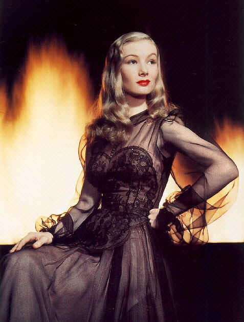
(One from the vaults that seems appropriate after the ‘Cinemascope Stud’ post - originally published in the Independent on Sunday, 14 September 2003)
Living as we do in a makeover world where everything, from historic buildings to royal families, to working-class political parties has been revamped and redecorated by popular taste, it is inevitable that the dowdy, gritty, black-and-white past should be made over too. Hence the yen in the last few years to render the past in colour. Aesthetic revisionism aims to turn history into a coffee-table magazine.
Clearly the most tragic thing about, say, the Second World War, is that it was shot in black and white. I mean, such a gorgeous and expensive fashion shoot with a cast of hundreds of millions and the photographer only brought his monochrome film! How are we supposed to get the cover? And so, inevitably, the war photographer has been sent back in disgrace to get his colour film (which only began to be generally available in the late 1930s).
The relatively tiny amount of colour film that the last World conflagration was exposed to, and the even smaller percentage that has survived (early colour processes used organic dyes), has now of course been assiduously collated by researchers into TV documentaries and books.
Kodachrome, made by the American Eastman Kodak Company, was by far the most stable of the early colour formats: its yellow dye - the most volatile - when stored at the correct temperature, fades in the dark by only 20 percent over 185 years. Thus, Kodachrome has become the 'color' of the past.
However, the remarkable stills in Kodachrome: The American Invention of Our World, 1943-1957 are not simply aesthetic revisionism; covering as they do the two decades in which the world was 'colorized' and Americanised, they also offer a document of how this came about. This is history as a coffee-table magazine – but, to paraphrase Winston Churchill: some coffee, some table.
Culled from magazines and government archives, they include celebrity publicity shots and historical events: Elvis Presley rubs shoulders with Dwight Eisenhower, Rita Hayworth with the Korean War, Joe DiMaggio with the Bikini Atoll test. This is as it should be: the magazine culture which American 'color' made possible has equalised celebrity and history — as long as history can be made to look like a celebrity.
The famous Yalta Conference of 1945, the meeting between Stalin, Roosevelt and Churchill which shaped the post-war world and American hegemony, is depicted on the cover. As a picture of 1940s male politicians in formal dress, it is effectively still in the black and white format we are used to - except for the faces. Stalin looks swarthier and more brooding. Roosevelt looks sicker (he was to die not long after), but more hard-faced. Churchill looks fatter and tipsier, and more vulnerable (he was playing gooseberry by this time to the two new superpowers). Eden, his foreign secretary glamour-boy, looks quite flushed (perhaps because he appears to be being buggered by the grinning man standing behind him).
In other words, historical figures and ciphers have been turned into fully fleshed personalities by 'color'.
This is not so surprising, since the entire tonal palette for Kodachrome was based on rendering the skin tones of those who would be its principal consumers as pleasingly as possible: Caucasians. Or more particularly: northern European-descended. (Hence Stalin looks less 'Caucasian' because he actually came from the Caucasus).
'Color' is literally the colour of American consumerism. Japanese Fuji colour film followed the same imperative, but for Asians. Pinks and reds are the colours which 'color' recognises and amplifies most dramatically, though sometimes the effect is akin to a mortician’s make-up: people occasionally appear as if they have been painted after death to give the illusion of life, which of course is, historically speaking, exactly what has happened.
Just as it is difficult to tell whether pink is a diluted version of red, or red a more intense version of pink, it can be difficult to tell the difference between blood and make-up, heat and death. Veronica Lake appears in Wagnerian splendour in a publicity shot [top] for I Married a Witch (1942), but most of the colour comes from the flames (of Stalingrad?) behind her.
A pretty female worker in a munitions factory inspecting .30 machine-gun rounds sports lipstick and nail varnish which appears to be exactly the same red as the tips of the rounds. Even her rouge appears to be of the same hue. She seems eerily stained in blood: a collision of purity and sex, death and life. By comparison, a tinted photo of her young soldier husband by her side appears ominously anaemic.
This collection also reveals that while, until Elvis Presley, white men were in mono, except for their faces, white women were in colour, except for their faces, which appear pancaked kabuki-white, the only colour being the red gash of the lips, and a doll-ish blush of rouge - perhaps the result of the dominance of black-and-white photography and movies until this time. The only colour in a 1948 publicity still of black-and-white film of diva Bette Davies is her scarlet lips. A young Liz Taylor snapped in the same year on the other hand is allowed a certain natural-looking bloom, perhaps because she promises a fully colorized future.
In colour the Nazis are not so smartly and powerfully dressed as they appear in black and white (or contemporary Hollywood movies): they look cheap and kitsch. Hitler’s face looks rattier and more dissolute. Brownshirts appear to have cerise pink borders on their caps: the same pink, it just so happens, that explodes from the dress and lips of the model on the cover of American Vogue in 1941, the year of Pearl Harbor.
Two years later, pink has intensified into red lust in the form of a skimpily dressed and reclining Jane Russell in a poster for The Outlaw - the same sinful red heat that suffuses a picture of the Bikini Atoll test in 1954.
In a portrait of black American boxer Sugar Ray Robinson (1950) resplendent in his pink suit leaning on his pink Cadillac parked outside his pink-lettered businesses in Harlem. Pink in a colorized world is the sugar-ray colour of success, of money, of power, of… whiteness.
As pictures of (not many) other black stars here such as Frankie Lymon illustrate, non-white skin is rendered especially strangely by Honkychrome: sometimes appearing like a melting chocolate gateau. Hence the unintended salience of a photograph of a nuclear test mannequin used in 1955 US A-bomb tests in Nevada which found that dark clothing and skin — but not light skin — burn at 7,000ft from ground zero: the Kodachrome bomb.
Looking at this collection it becomes apparent that pink became the defining colour of the 1950s because of Kodachrome’s palette. As demonstrated by the pastel pictures of Elvis towards the end of the book: a man whose favourite colour was pink. It was his pink lips, as much as his swinging hips, which were the key to his success and the way he became the icon of that decade.
What we understand by “colour” today is entirely shaped by 'color' and the advances in colour reproduction techniques since the 1950s which have made Kodachrome itself almost obsolete. Colour, pre-Kodachrome, was simply ‘life’. Photographs were shadowy representations of life — hence they were in black and white.
These early colour photos in their chromic crudeness do not reveal a brilliant world suddenly illuminated by the sun peeking from behind a cloud, but rather a world which is still mostly blissfully innocent of what 'color' is, a world where magazines and consumerism have not yet sucked the juices out of life.
In 1939 people had not yet learnt to see the world through Kodachrome eyes. By 1959, however, this was all they could see.